Standvast: Brand Identity Design for a Logistics Company
Standvast, a B2B fulfilment and logistics company, wanted to stand out in a crowded market with a more distinctive and recognisable brand identity.
Their existing visuals felt flat and didn’t reflect the smart, AI-driven nature of their offering. Rather than a full rebrand, the goal was to evolve the existing branding –creating a more modern and flexible visual language that could work consistently across website design, marketing assets, and sales materials.
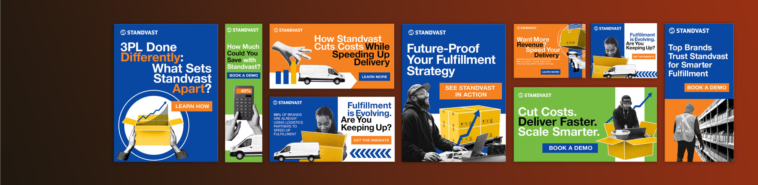
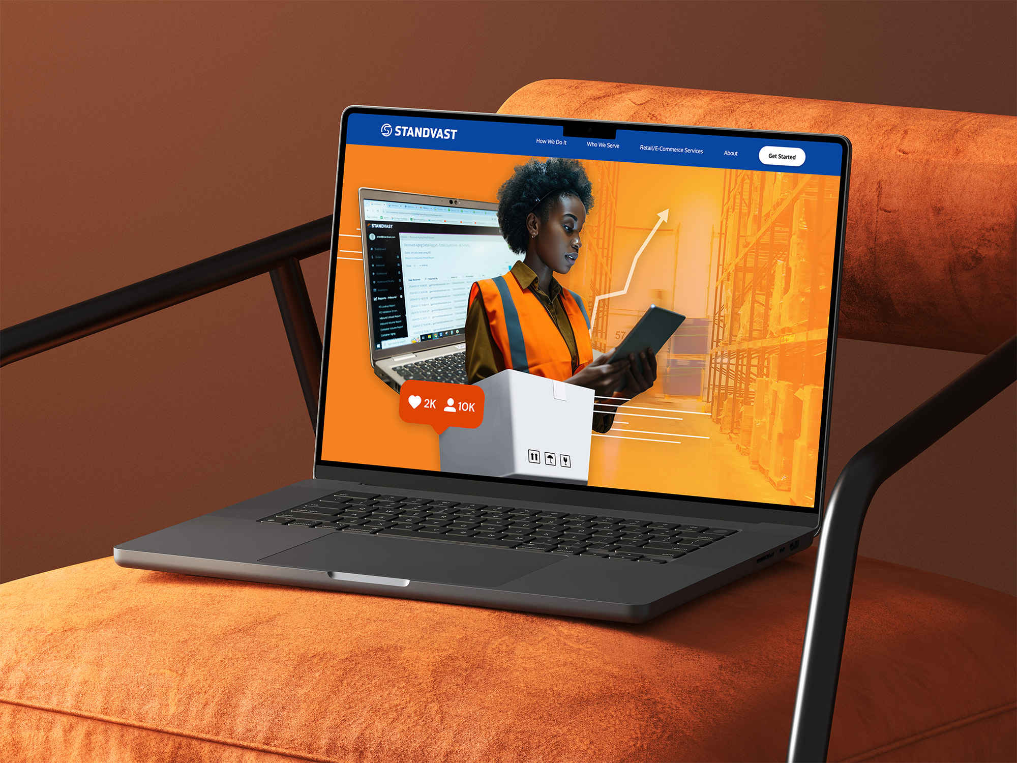
I treated the project as a brand identity refresh, focusing on refinement rather than replacement. The core blue and orange palette was updated with brighter, more contemporary tones, and a vibrant yellow was added to highlight key content, including case studies and conversion-focused sections.
I developed a collage-based visual system to add depth and flexibility to digital assets, including web pages, social media, and campaign materials.
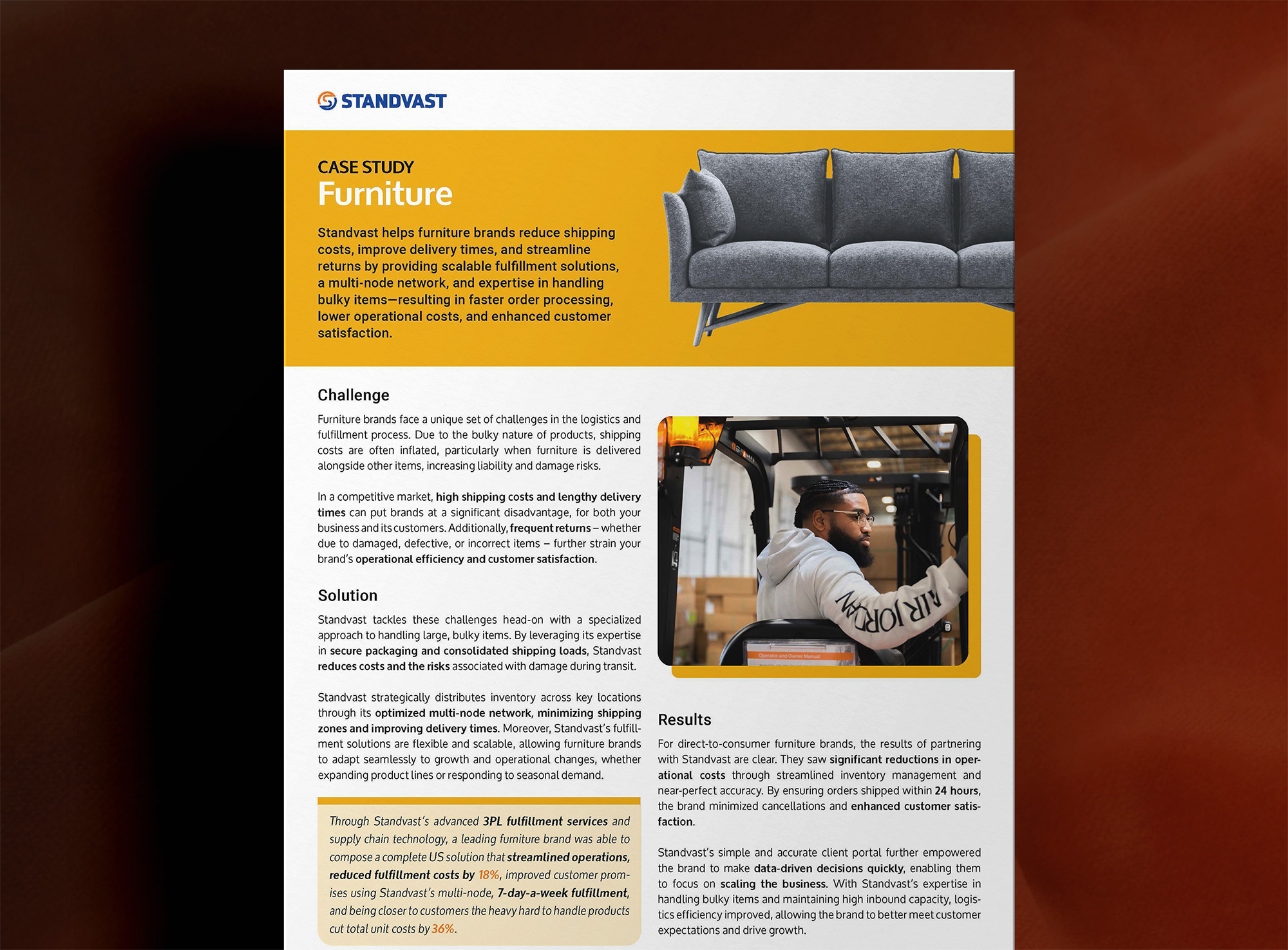
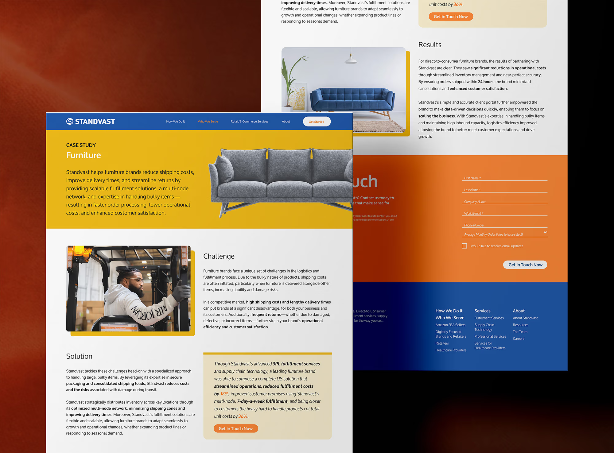
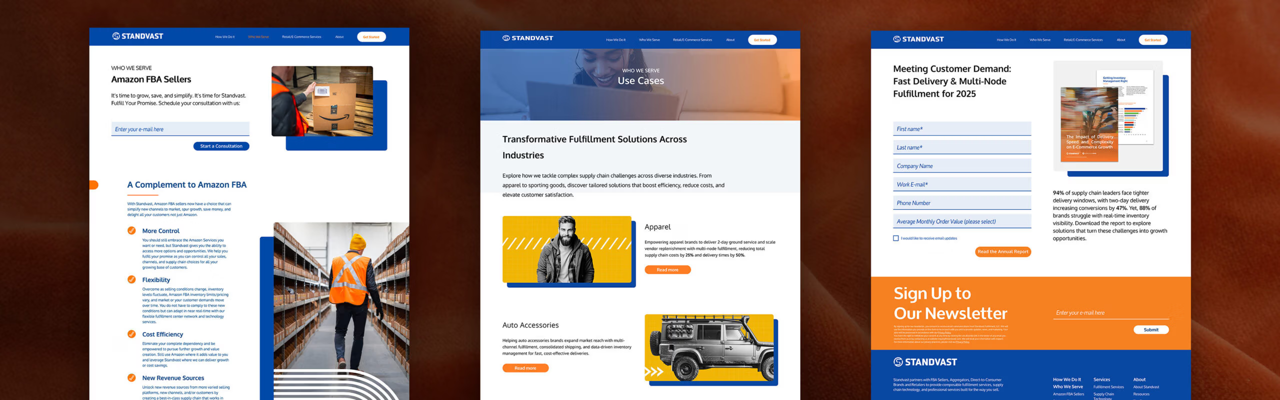
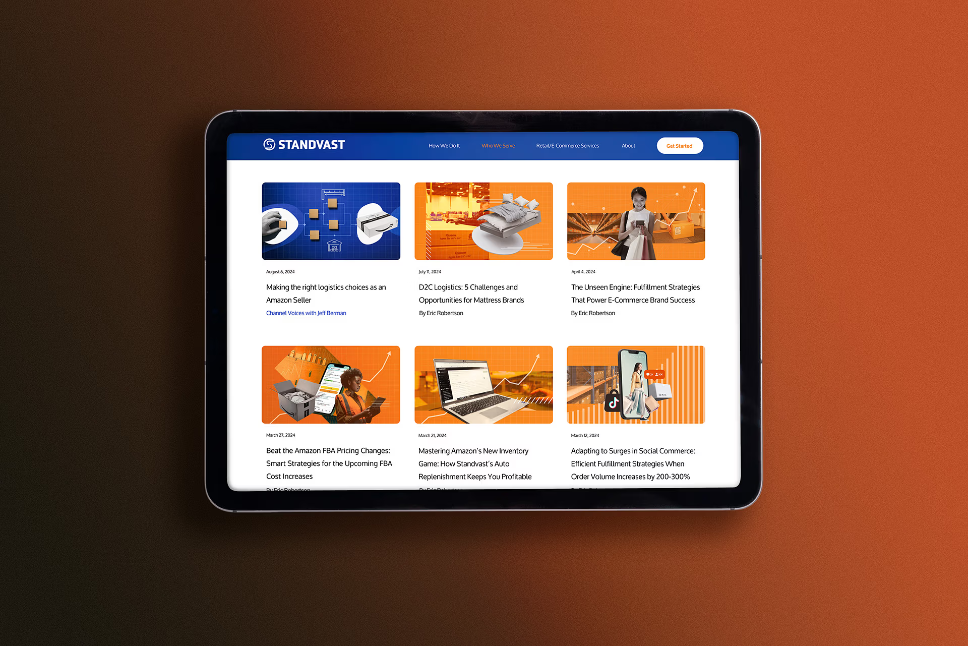
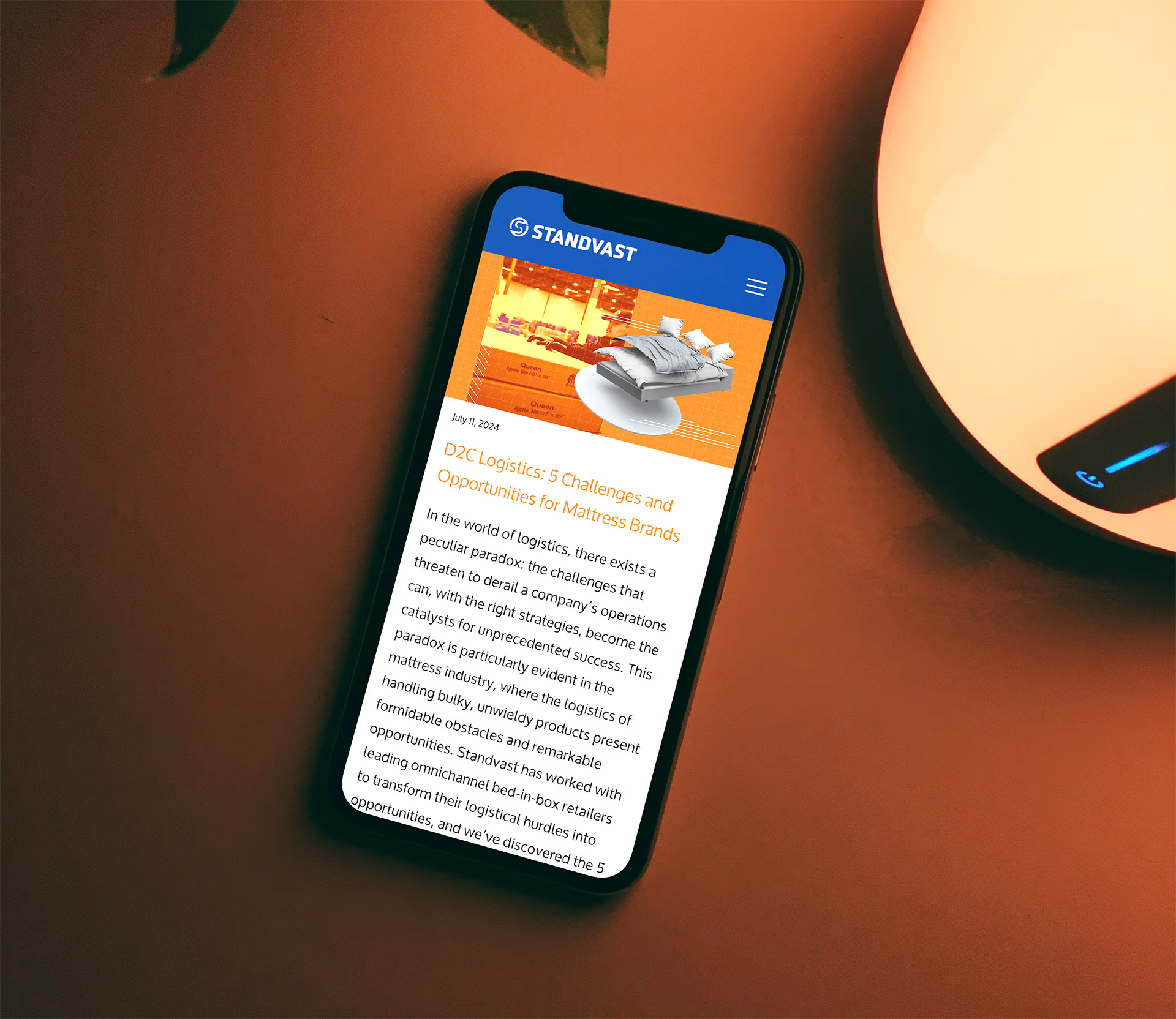
I also designed a modular, WordPress-friendly layout for case studies and landing pages to structure content clearly while maintaining a strong visual identity. The system was adapted for PDF use, enabling the sales team to support customers across multiple touchpoints.
The result is a modern, high-impact brand that enhances recognition and positions Standvast as a forward-thinking, technology-driven logistics company.
Are you seeking greater clarity and consistency for your brand?